API reference
<Copilot>
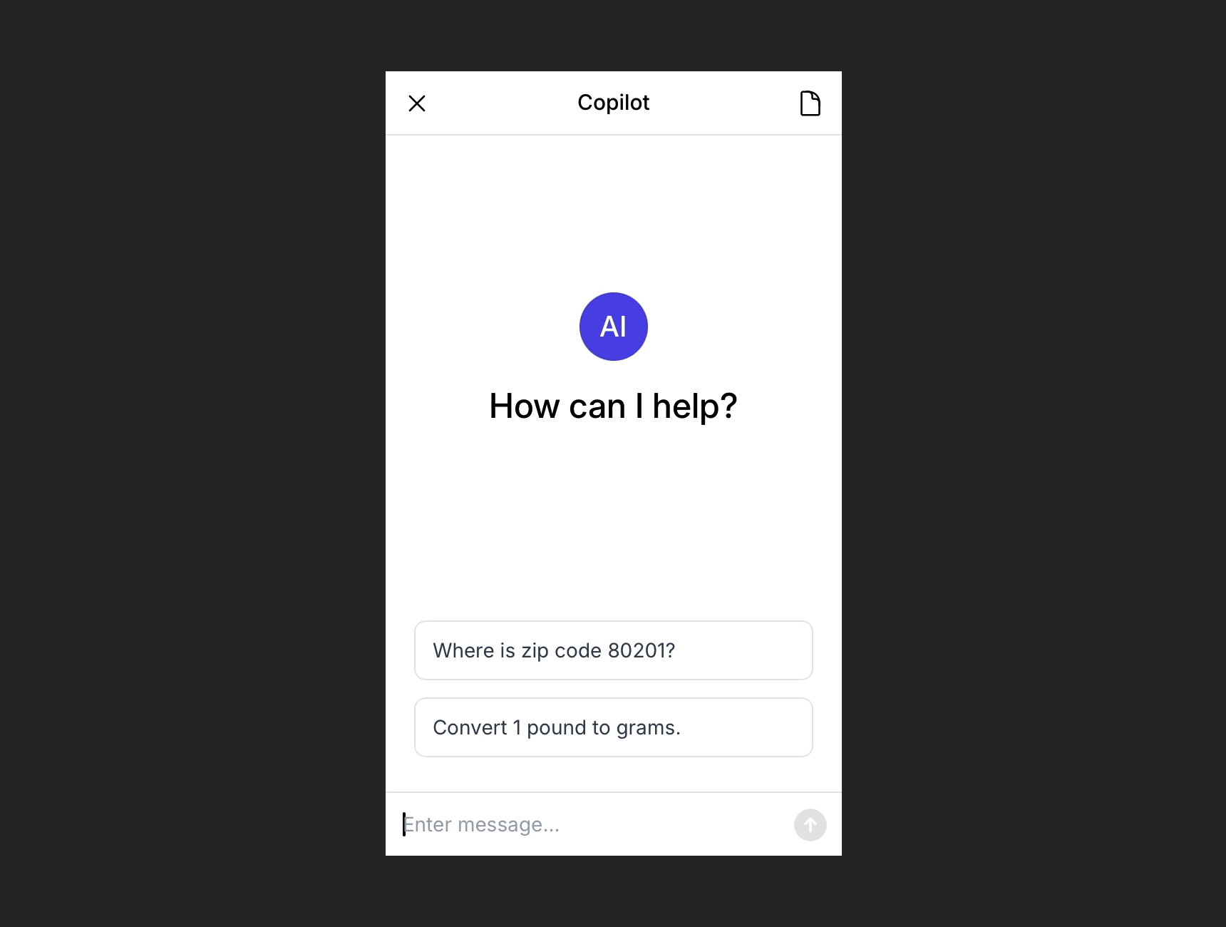
The <Copilot> component is a chat UI, pre-styled with Tailwind CSS:
Rather than installing <Copilot> as a dependency, you download and copy it into your project. This allows you maximum control over the component's appearance and behavior.
To use <Copilot>, wrap it in a <CopilotProvider>:
// Example.jsx
import { CopilotProvider } from '@copilotjs/react'
import { Copilot } from '@/components/Copilot' // The folder where you placed Copilot.

export default function Example() {
  return (
    <CopilotProvider copilotId="..." userId="..." companyId="...">
      <Copilot className="h-[600px] w-[400px]" />
    </CopilotProvider>
  )
}
Props
Use these properties to configure the <Copilot> component.
| Prop | Description | Type | Required |
|---|---|---|---|
isOpen | A flag to open or close the copilot. | boolean | no, default is true |
id | HTML attribute passed through to the component's container. | string | no |
className | HTML attribute passed through to the component's container. | string | no |
headerTitle | The title on the copilot header. | string | no, default is 'Copilot' |
welcomeTitle | The title on the welcome panel. | string | no, default is 'How can I help?' |
welcomePrompts | The example prompts on the welcome panel. Use empty array to hide examples. | string[] | no, default is [] |
userName | The name of user. | string | no, default is 'You' |
userInitials | The letter initials of the user avatar. | string | no, default is 'Y' |
userColor | The background color of the user avatar. | string | no, default is 'bg-gray-800' |
assistantName | The name of assistant. | string | no, default is 'Copilot' |
assistantInitials | The letter initials of the assistant avatar. | string | no, default is 'AI' |
assistantColor | The background color of the assistant avatar. | string | no, default is 'bg-indigo-600' |
enableUndo | Enable/disable the user to undo actions performed by the assistant, directly in copilot. | boolean | no, default is false |
onClose | Function invoked when the user closes the copilot. See close event example. | (event) => void | no |
onUndo | Function invoked when the user undoes an action in the copilot. See undo event example. | (event) => void | no |
onRedo | Function invoked when the user redoes an action in the copilot. See redo event example. | (event) => void | no |
Example
// Example.jsx
import { CopilotProvider } from '@copilotjs/react'
import { Copilot } from '@/components/Copilot' // The folder where you placed Copilot.

export default function Example() {
  return (
    <CopilotProvider copilotId="..." userId="..." companyId="...">
      <Copilot
        isOpen={true}
        id="my-copilot"
        className="h-[600px] w-[400px]"
        headerTitle="Copilot"
        welcomeTitle="How can I help?"
        welcomePrompts={['Add 2 concentric circles.', 'Clear the canvas.']}
        userName="You"
        userInitials="Y"
        userColor="bg-gray-800"
        assistantName="Copilot"
        assistantInitials="AI"
        assistantColor="bg-indigo-600"
        enableUndo={false}
        onClose={(event) => console.log('The user closed the copilot.')}
        onUndo={(event) => console.log('The user undid an action.')}
        onRedo={(event) => console.log('The user redid an action.')}
      />
    </CopilotProvider>
  )
}
Events
The <Copilot> component emits multiple types of events, described below.
close
When the user closes the copilot, the onClose handler is invoked with an event such as:
{
  "type": "close",
  "data": {}
}
undo
When the user undoes an action in the copilot, the onUndo handler is invoked with an event such as:
{
  "type": "undo",
  "data": {}
}
redo
When the user redoes an action in the copilot, the onRedo handler is invoked with an event such as:
{
  "type": "redo",
  "data": {}
}